Monday, December 5, 2016

Assignment 1: Analytical Task

It's now time to complete the Assignment 1 Analytical Task - our first piece of written coursework. 

A reminder of the task AQA have set you:

Analyse the cover pages of two popular magazines. How do the covers appeal to their audiences?

Word count: 750 words
10 marks

AO2: Analyse and Respond

Remember - we add a couple of details to that. Firstly, the two magazines must be from the following choices and aimed at different audiences:

Magazine 1: GQ OR Men's Health
Magazine 2: Glamour OR Empire

Secondly, you also need to analyse your own magazine cover. You'll get some lesson time later to finish your cover so don't worry if that's not yet complete.

You can find guidance for the layout of the Assignment 1 Analytical Task here.


Remember, you must use the official magazine Media Packs to help you with the target audience:

GQ Media Pack
Men's Health Media Pack
Glamour Media Pack
Empire Media Pack

Remember, we analyse something by explaining HOW and WHY it is produced in that way and the EFFECT it has on its audience. For an A*, you need to explain in real detail and offer alternative interpretations.

One of the ways of doing this is making sure we use those key words and phrases to show connotation:

This tells the reader...
This could signify...
A possible interpretation of this is...
The reader could infer that...
This shows the audience...
This suggests to the reader...
From this, the audience will understand that...
This connotes...
This is significant because...
This creates...
This emphasises...

Your analytical task must be completed in school and is due in the first week after Christmas - good luck!

Wednesday, November 16, 2016

Mr Halsey cover work - Y10 Media Thursday 17 November

Apologies - I'm out on a Year 13 trip to a BFI screening and workshop so won't be in Thursday's double lesson.

The work is exactly as we discussed on Tuesday. Work through the following in order:

1) Complete your Assignment 1 planning documents and put them in your coursework folder. This means a planning sheet and two sketches (one of which is in colour). Coursework folders should be at the front of DF07.

2) Log on to your normal PC and start designing your magazine cover using Adobe Photoshop. Create a new A4 portrait page and add the title, slogan, main flash and cover lines in preparation for the photoshoot next week.

Unfortunately, we are short of Media staff on Thursday to help with technical questions but there are plenty of tutorials to help with your Photoshop work. We have plenty on the Media Shared drive: M:\How To Guides\Adobe Tutorials and you can also use YouTube tutorials too. 

This should give you plenty to get on with - good luck and keep up the good work!

Tuesday, November 8, 2016

Helpful Links for Learner Response

Hello Year 9- It's time to get going!

Image result for writing   Image result for writing

Here are all the links to the previous blog tasks. Every single one of these needs to be on your blog and complete:

Tasks that need to be on your blog
•             First Blog task – answering the questions about your choice of GCSE Media and an analysis of the clip from BBC Drama series Sherlock

•             Film Poster analysis using LIAR (Language, Institution, Audience and Representation)

•             Fruit Bowl task using Photoshop – one of your own design and one sampling a theme http://mediamacguffingcse.blogspot.co.uk/2016/09/year-9-fruit-bowl-task.html

•             Camerawork: Photos to show understanding of camera angles with storyboard (using the photos you took during the lesson)

•             Minority Report – Shot by Shot analysis

•             Cuts and Transitions work – posted on blog on Thursday October 6th. Film clip and notes on transitions (use your books)

•             Watch the editing video

•             Audience Profiles – Demographics and Psychographics
You had to find adverts aimed at teenage boys, men in thirties, mothers, old people, families and post them up

•             Audiences Task- Create an audience profile for a magazine using Photoshop and upload

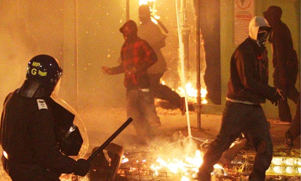
•             Representation of Young People- watch the video of the rioters being interviewed and find a positive and a negative representation of teenagers and upload.

•             Half term homework –Answer the 12 questions about the magazine you are planning and then add paragraphs planning costume and props for photo shoot. http://mediamacguffingcse.blogspot.co.uk/2016/10/half-term-homework-planning-for.html

•             Analysing a Magazine cover


Miss Fowler's Class Blog Feedback and Learner Response

Blog Feedback- This week's lessons - Time to Reflect

Image result for reflect

Hello Year 9!

You will each have received an email from me on your SCHOOL EMAIL with the title 'Blog Feedback'. Please read this carefully as it gives you information about what is missing or needs improving on your blog so far.

Whilst most of you have made an excellent and committed start to the course and shown real potential in Photoshop and practical tasks, some of you are missing a lot of work on your blog and I am not impressed! This is a GCSE where coursework is worth 60% of your final grade so commitment to finishing all work to the best of your ability here and at home is essential.

Task
1) Please read the feedback and then post my feedback on a new blog post on your blog. Call it 'Blog Feedback and Learner Response.'

2) Read the EBIs carefully so that you know what you have to improve upon.

3) Post the Learner Response and then DO the learner response. This might involve looking back on your own work in your drafts, finishing it and then publishing it or (if you missed a lesson) it might involve finding the work on Macguffin so that you can catch up.

There is a lot of work for some of you to do but it is necessary for us all to be in the same place before we continue with Assignment 1.

Those of you who ARE up to date, well done! You can make any changes that I have asked for and then you can continue with the Magazine Analysis task and doing your sketches and planning documents for Assignment 1. Make sure that everything goes into your blue folders.

Thank you

Miss Fowler

Wednesday, November 2, 2016

Assignment 1: Magazine cover key conventions

This week's lessons are all about learning the 12 key conventions of magazine covers and starting to develop our written analysis.

The detailed notes on the key conventions of magazine covers can be found here.

Your blog task is as follows:

1) Use Google images to find a magazine cover of your choice. Make sure it is a UK-based magazine.

2) Copy the image into PowerPoint.

3) Find as many of the 12 key conventions of magazine covers as you can on the front cover and annotate the key conventions on PowerPoint using arrows.

4) Choose three of the key conventions and write 50-100 words of analysis for each. The key here is to explain how the key conventions target the magazine’s audience. Example:


5) When finished, save your PowerPoint slide as a JPEG and upload to your blog with a brief explanation of the task.

Good luck!

Tuesday, November 1, 2016

Assignment 1 - Analysing a Magazine Cover

Individually complete the following activity:
1.Log on to a computer
2.Use Google images to find a magazine cover
3.Copy it into PowerPoint
4.Find as many of the 12 key conventions of magazine covers as you can on your front cover and label them
5.Choose three of the key conventions and write 50-100 words of analysis for each. Explain how the key conventions target the magazine’s audience.

6.When finished, save as a JPEG and upload to your blog with an explanation of how you did it.

An example is given below.
Do not forget to use the language from the Key Conventions sheet. 


Thursday, October 20, 2016

Half Term Homework - Planning for Assignment 1

Assignment 1- The Magazine Cover

*Remember our magazine cover conventions*


  1. -A bold, snappy title reflecting the ethos of your magazine in the top third. What is your title? What does it connote (suggest) to audience? What is your magazine ABOUT?
  2. -Rule of thirds- how will you use this?
  3. -A tag line linking to your title - what is this and how will it link to your title?
  4. -A strong central image using a medium close up / close up / medium shot (no bigger than this and no more than two people; strongest covers use one) What is this image going to show?
  5. -A colour scheme of three main colours which signify certain connotations you want your target audience to take away with them
  6. -The letter 'i' and the word 'free' as this is a supplement with the 'i' newspaper- where is this going to be included? (eg will you incorporate it into your title?)
  7. -A main cover line that is related to the central image and is dominant and placed where the eye goes after the title. 
  8. -Three or four 'flashes' or secondary cover lines telling the reader in short phrases (without connectives) what will be in the magazine. There should be a theme running through these stories that works with your overall ethos. 
  9. -Perhaps a competition 
  10. -Perhaps a strap line at the top and / or bottom of the cover to make it look stylish and clean.
  11. -Font choice should be consistent and bold and eye-catching (no hard-to-read fonts please or ones that resemble handwriting!)
  12. -Some links to social media or something that suggests that the target audience can engage with your product on more than one media platform. 


Please copy and paste the above and write a short paragraph under each one explaining what you plan to do to match this convention and why you have made those choices. Extra achievement points for using media language (eg the connotation of pink is... OR This will appeal to my target demographic because...)

Please add a paragraph at the end answering these two questions:
a) Who is going to be in your picture and what camera angle / lighting will you use? Who will take the photos?
b) What costume and props and make up will you need to remember to bring in?

We will be doing our photo shoot with professional lighting after half term so you need to have planned to succeed so you can make the most of this opportunity.

Thank you and have a fabulous half term!
Thanks for all your hard work in Media this half term - keep it up and we will match the success of some of the phenomenal work we have seen from previous students on the blogs and in the recent Media Awards 2016.

Miss Fowler :)

Tuesday, October 18, 2016

Representation - young people

Image result for girls in riots who stole wine

Representation

Watch this clip of the riots from rioters in their own words:


Task-

1) Find a POSITIVE (conventional) representation of young people and write a paragraph explaining why it is positive.
2) Find a NEGATIVE (conventional) representation of young people and write a paragraph explaining why it is negative.


Remember DENOTATION (what you see) and CONNOTATION (what it suggests) in your answers.

Thursday, October 13, 2016

Blog Task- Audiences

Target audience task

Create an audience profile for a magazine of your choice using Photoshop.
First, use demographics: Age, gender, education, social class, race/ethnicity, job/profession/ earnings, home (city/village/countryside).

Then use brand logos that the audience will use or enjoy and build them into your profile.

Tuesday, October 11, 2016

Audience Profiles - Advertising Blog Task

A reminder from today's lesson on Audience:

Audiences are classified in terms of-

1) Demographics
This refers to groups of people such as: race, gender, age, social class, job (and education level) and where people live (urban or rural).

2) Psychographics
This refers to people's hobbies and interests eg what they are interested in and what they like doing in their spare time eg sporty, into partying, music lovers, interested in being fashionable and care about their appearance.


YOUR TASK today-
Find an advert that is aimed at the following and explain HOW you know:
1)Teenage boys who are sporty
2)Men in their thirties who care about their appearance
3)Mothers
4)Old people with disposable income to go on holidays
5)Families who like spending time together

Embed your links or images – can be print or moving image (but you must have some of both)

Extra points for writing DEMOGRAPHIC / PSYCHOGRAPIC and CONNOTATION!

Thursday, October 6, 2016

Editing Task


Most Memorable Editing Moments of All Time

Please watch this to consolidate (go over) some of the techniques we have learned about today!

Thanks

Miss Fowler :)
Editing / Cutting in Media

Image result for editing transitions

We have looked at camera angles and now camera movements. These are the first steps to making a film but, after the film has been made, the hard part begins! All those shots have to be EDITED together to make sense.

Cutting describes the process of going between shots, with the purpose of advancing the story (narrative) or moving action along or changing perspectives. There are so many different cuts but we usually don't notice them because they happen so quickly!

Transition - refers to how one shot changes to the next one eg the famous Wipe in Star Wars films.
Class Work - 25 mins

1)Find a film clip no longer than 3 minutes.
2)Embed the film clip onto your blog with the title of the film
3)Analyse the editing- types of cuts used, pace and transitions.

4)Pick 3 camera angles and explain the effect of them. 


Homework 
Watch this video again (from 0.30 secs to 5.29 mins) and make notes on the following cuts to publish on your blog:


1) Cutting on Action
2) Cut Away
3) Cross Cut
4) Jump Cut
5) Match Cut (Match on Action)
6) Fade In/Fade Out transition
7) Dissolve transition

Just define the term (say what it is) and then say WHY / WHERE often it is used.
To challenge yourselves, try and find an example of each of the cuts!
Good luck!

Miss Fowler

Wednesday, October 5, 2016

Media Awards nominations!

With the Media Awards rapidly approaching we are delighted to announce this year's nominations!

The quality level at both GCSE and A Level was exceptionally high and it has been an extremely difficult process narrowing down the nominations for our Oscars-style event. To find out the winners you'll need to attend the exclusive Arthouse-themed ceremony on Tuesday 18 October. Tickets go on sale Monday 10 October and cost £3 if purchased in the first week. The price then goes up to £5 but be quick - the Awards have sold out days in advance for the last few years!

Media Awards 2016 Nominations

A Level

Best Y12 Original Screenplay
Insanity
Kiss of Death
Loop

Best Y12 Production Design
Project KR
La Sombra
Transgression

Best Y12 Dialogue/Voiceover
Amelia
La Sombra
Transgression

Best Y12 Cinematography
Exposure
My City
TicTacToe

Best Y12 Sound Design
Kiss of Death
Amelia
TicTacToe

Best Y12 Film Editing
Hunting Season
My City
Exposure


GCSE

Best GCSE Cinematography 
Flight – William Welhenage 
Buried Alive – Emman Chaudhry
Song - Hitik Gohil

Best GCSE Music Video Concept
Perfect – Sabrin Ibrahim
Buried Alive – Emman Chaudhry
Seven Nation Army – Mohammed Omar

Best GCSE Production Design
Hotline Bling - Krissah Rolle 
Dollhouse – Zayna Malik
In the End – Jason Boachie

Best GCSE Editing
Not Afraid – Hussein Hamume 
Red Lips - Narin Omar
Thrift Shop – Abdullah Al-Fadhli


Acting

Best Actress/Actor
Katie Foster – Kiss of Death
Saanya Shah - Amelia
Sabrin Ibrahim – Perfect 
Zayna Malik - Dollhouse
Callum Louis – La Sombra
Mamduh Adan – Hunting Season
Hussein Hamume – Not Afraid
Jason Boachie – In The End


Congratulations to all our nominees and see you at the Media Awards!

Camerawork and editing: Minority Report analysis

We are now going to use everything we have learned about film language (camera shots, movement and editing) to produce a shot-by-shot analysis of key shots in the Minority Report sequence.

Remember, writing analysis in Media means picking out the interesting or important aspects of something and then examining WHY or HOW they have been put together to create an effect on the audience.

The images are below and also on the M: Media Shared drive > Resources > Camerawork - Minority Report

Here's an example of what you need to do:


Over-the-shoulder / medium shot (OTS/MS)

The over-the-shoulder angle allows a point-of-view shot from the perspective of the man reading the newspaper. The medium shot allows enough background to establish the location as a metro train. The corner of the seat immediately in the foreground also helps place the location. The over-the-shoulder shot also means the following shots, with the newspaper man recognising the fugitive, are easy for the audience to interpret.


The shots you need to analyse:

Shot 1


Shot 2

Shot 3 

Tuesday, October 4, 2016

Camera work and Editing: Minority Report (shot by shot analysis)


Image result for minority report

Please go to Media Student Shared and upload the three shots with a shot analysis.

(Media Student Shared / GCSE / Introduction to Media / Camerawork- Minority Report)

Identify the SHOT type and CAMERA MOVEMENT.
Then say WHY this shot and movement is appropriate for this point in the clip and the effect on the audience. See my example below.
Image result for minority report newspaper screenshot


Over the Shoulder Shot / Medium Shot

The over-the-shoulder angle allows a point-of-view shot from the perspective of the man reading the newspaper. The medium/long shot allows enough background to establish the location as a metro train. The over-the-shoulder shot means the following shots, with the newspaper-reading man recognising the fugitive, are easy for the audience to interpret. The concept of a fugitive on a mission to clear his name is a classic narrative in the action or adventure genre, with many obstacles and challenges ahead before the main protagonist (hero Tom Cruise) can succeed.

Wednesday, September 28, 2016

Camerawork: Photo storyboard

Your photo storyboard needs to include the following ten shots and angles:

Camera shots recap:
  • Wide shot / establishing shot (WS/ES)
  • Long shot (LS)
  • Medium shot (MS)
  • Medium close up (MCU)
  • Over-the-shoulder shot (OTS)
  • Close up (CU)
  • Big close up / Extreme close up (BCU/XCU)

Camera angle:
  • High angle: makes subject look small and weak.
  • Low angle: makes subject look big and powerful.
  • Unusual perspective: can be used to surprise the audience or show danger (e.g. looking down off a cliff)

To get an example of what your photo storyboard should look like, have a look at this example from last year or this one - both very good.

Remember - you need to include all ten shots/angles and write an analysis to go with each shot to explain what it communicates to the audience.

Finish this for homework if you don't complete it in the lesson - due for your double lesson next week.

Good luck!

Thursday, September 22, 2016

Year 9 Fruit Bowl task

Year 9 period 1 & 2- Miss Fowler's class
Photoshop fruit bowl workshop (continued)


Choose a word from the list provided below:

Urban
Fashionable
Expensive
Skin-tone
Pastel

Vibrant
Fresh
Youthful
Earth
Autumn
Winter
Fruity
Horror
Punk

You should complete a palette on Photoshop with all the colours that fit your chosen word. The next step is to develop this into a creative fruit bowl using the eyedropper tool on Photoshop. Select a photo from Google images that represents the word you have chosen and then paste that into your fruit bowl template. A few links to help you:

Fruit bowl template: Media Shared > Resources > GCSE > Introduction to Media > GCSE Photoshop exercises > FRUIT BOWL COLOUR TASK

Remember to save it in YOUR own folder on the Media Shared drive before doing any work on it.

What we're hoping to create:


If you finish a fruit bowl, you can save it as a JPEG and upload it on your blog. There is an extension exercise using the 'Paste into' and magic wand features which Mr Qureshi can demonstrate if you get there. Have a go at using 'Paste into' using lots of different images that are all related eg horror. Make a fruitbowl using the different images as a collage. 

After you have completed your 3 fruit bowls (palette/poster/theme), upload them to your blog and answer the following questions underneath:
1) Which do you think worked most successfully as a design? Why?
2) Show your fruitbowls to the person next to you and get a WWW and an EBI feedback point from them. Write this on your blog with their name. 
3) What have you learned about Photoshop? Write out the instructions for another student who has not used Photoshop before. This will help you to revise the skills you have learned. 
4) Pick 5 colours and google the CONNOTATIONS of these colours. Add this information to your blog. 
5) If you finish all of the above, make a mood board for your theme. Does it match your fruit bowl? How can you tell?

Good luck - the most important thing is that you spend the lesson getting to know Photoshop and making mistakes along the way. That's how we learn! And I will be there to help. 

Miss Fowler :)

Wednesday, September 21, 2016

Mr Halsey cover work: Thursday 22 September

Year 10: I'm sorry I won't be in our lesson on Thursday - I'm out at an AQA Media briefing that I can't get out of.

The work is all set up and after a short demonstration from Mr Qureshi you should be able to log in and get on with it. This is what you need to be working on:

Photoshop fruit bowl workshop
You should have completed a palette on Photoshop with harmonious colours that fit your chosen word. The next step is to develop this into a creative fruit bowl using the eyedropper tool on Photoshop. Select a photo from Google images that represents the word you have chosen and then paste that into your fruit bowl template. A few links to help you:

Fruit bowl template: Media Shared > Resources > GCSE > Introduction to Media > GCSE Photoshop exercises > FRUIT BOWL COLOUR TASK

Remember to save it in YOUR own folder on the Media Shared drive before doing any work on it.

What we're hoping to create:


If you finish a fruit bowl, you can save it as a JPEG and upload it on your blog. There is an extension exercise using the 'Paste into' and magic wand features which Mr Qureshi can demonstrate if you get there.

Good luck - the most important thing is that you spend the lesson getting to know Photoshop and making mistakes along the way. That's how we learn!

Thursday, September 15, 2016

Key Concepts: Writing media analysis

If you missed any of the notes from this week's lesson this should help:

Language

  • The Language of Media Studies
  • How we ‘read’ media texts
  • Recognising the codes and conventions of media texts
  • Key media terms e.g. genre… denotation… connotation… narrative… 


Institution
  • The companies or organisations behind the media
  • Most aspects of the media are a commodity: something that is bought and sold. There is competition and a demand for profit.
  • Huge institutions are called multinationals e.g. News International
  • Smaller institutions can include media texts we create ourselves (blogs etc.)


Audience
  • The people who consume media products
  • How does the media influence its audience? Who holds the power?
  • How is an audience targeted? What do the audience enjoy or learn from the media product?
  • Audience research: who exactly is buying our product?

Representation
  • The people who consume media products
  • How does the media influence its audience? Who holds the power?
  • How is an audience targeted? What do the audience enjoy or learn from the media product?
  • Audience research: who exactly is buying our product?

Key Concepts blog task

1) Find a film poster of your choice (use Google images)
2) Write an analysis of the film poster on your blog using the four key media concepts: language, institution, audience and representation.

Finish for homework if you don't complete it during today's lessons.


The key questions to ask:

Language: how do we know it is a film poster? What impact do the key conventions have on the audience?
Institution: who are the companies behind the film? Who directs or stars in the film? Who is making money from this media product?
Audience: who is the target audience for this film? How can we tell?
Representation: what representation of people or groups can we find in this poster? What does it tell the audience?


Example: Splice (2009)


Language
The title and tag-line, release date and billing block (information about the Director and the production company) all follow the expected codes and conventions of a film poster. The effect created here is…

Institution
The film was produced by Dark Castle (for Universal Entertainment) who are associated with horror… It was executively produced by Guillermo del Toro who is a well known director. It was commercially successful (being the highest grossing Canadian feature film in 2010)…

Audience
This looks like it would be targeted at an audience of mixed gender (although perhaps slightly more female?) An adult age range might apply due to the 15 certificate and the content which includes hybridity and genetic experimentation…

Representation
The focal picture shows a female in a dominant position with another female confronting her. There is a male in the background which is perhaps unusual, particularly in science fiction…


Film Poster Analysis Task

Hello!

We have analysed some film posters in class together for LIAR (Language / Institution / Audience and Representation). Start a new blog post called FILM POSTER ANALYSIS.

Please use your notes in your books and my example to help you with this task.

Google image a film poster of your choice. Copy and paste it into your blog.

Now analyse it using LIAR.

Miss Fowler

Wednesday, September 7, 2016

Welcome to GCSE Media!

Welcome to GCSE Media Studies - we have a brilliant two-year journey ahead of us and can't wait to get started! 

Over the next two years you will produce some amazing production work, learn a huge amount about analysing the media and end up with an excellent GCSE grade. All you need to do is put the work in!

Your first job is to start your GCSE Media blog. You can find step-by-step text instructions here. Once you have your blog URL, post it as a comment below with your name clearly written next to it. For example:

Ms Hill's blog: http://mediamacguffingcse.blogspot.co.uk/ 

IMPORTANT: It is absolutely essential you remember your log-in details for this blog - it is your Media work book for next two years. Make sure you do the following:
  1. If possible, add your mobile phone number so you can get a code by text if you forget your password
  2. Email your log-in details to yourself using your SCHOOL email address
  3. Write a reminder of your blog URL, log-in and password in your planner


First blog task

When you have set up your blog, it's time for your first blog post! Important: make sure you click on 'New Post' and NOT 'New Blog' when starting this process - it is a common mistake.

You need to answer the following questions (detailed, full sentences) as your first post:

1) Which part of the course are you looking forward to most?

2) What knowledge and skills do you hope to learn in Media?

3) What grade are you realistically hoping to achieve in Media?

4) What was the last TV programme or film you watched?

5) Why do you think that TV programme or film appealed to an audience?

6) What technology have you used to access the media in the last 24 hours? (Radio, TV, phone etc.)

7) What device do you use most to access the media?

8) Watch this clip from acclaimed BBC drama series Sherlock:


9) What do we learn about the characters from this brief clip?

10) What aspects of this show do you think an audience might enjoy? List at least three things and explain why the audience would enjoy each aspect.

Extension question: What can you spot in Sherlock that you will find in most television dramas? E.g. characters, dramatic music etc.) These are called key conventions - list as many as you can think of.

Note: If the YouTube clip isn't working please let your Media teacher know. While you're waiting for the issue to be resolved, read up on this episode of Sherlock on the brilliant IMDB website.

Finish these questions for homework if you don't manage to get through them in the lesson - due first lesson next week.

If you DO finish everything - well done! Spend some time looking through our Media blog, particularly at last year's Media student blogs. This will give you an idea of the fantastic work you will be producing over the next two years.

Thursday, June 23, 2016

Film project: re-cutting a trailer

Our next video project is a real challenge: re-editing a film trailer into a different genre.

This is both a technical and creative challenge with careful analysis, planning and editing required to achieve the desired effect. Your task is as follows:

Re-edit the Frozen trailer into a horror film.

Examples

There are many fantastic examples on YouTube of creative Film and Media students who have taken on a challenge like this.

Toy Story

Here's a YouTube example from someone who has already horror-fied the Pixar classic Toy Story to give you a great template for the Frozen task.

Original Toy Story trailer:


Re-edit for horror:


There are plenty more examples of trailer re-edits on YouTube such as The Incredibles re-edited as a Christopher Nolan film.


Top tips

This is a complex challenge - and before you start anything you'll need to make yourself an expert on the original Frozen trailer:


Next, think about the following:

  • Which conventions do you need to keep to establish it looks like a film trailer? E.g. keeping the MPAA Splash Screen. 
  • Which clips will your select to best fit the horror genre?
  • The Music - add a horror film score? Remove the original?
  • Are there any sound effects that will create a horror genre feel?
  • Which bits to leave out or change e.g. if they are singing, will this look strange? Could you leave speech in but order it so that the dialogue now seemed sinister?
  • Colour hues and tones / saturation / shadows
  • Visual effects? Ghosting etc?
  • Could you record a new voiceover?
  • Could you use your own titles / words to create the atmosphere and establish the horror genre for your viewer throughout the trailer?


Useful links

This YouTube collection of re-edited trailers may provide more inspiration and the website Total Recut is full of advice and tutorials to help with your re-edit.


Good luck - and be creative!